A curated edit of colorful fashion pieces designed to bring fresh energy to fall’s most-worn neutrals.
Black, charcoal, cream, camel, chocolate, and navy earn their place in a fall wardrobe for good reason. They layer easily, work across occasions, and give us a strong foundation to build on. But versatile doesn’t have to mean colorless.
A well-placed dose of color can change the character of those familiar neutrals without changing the entire wardrobe around them. Cobalt against charcoal, Petal Pink with chocolate, Emerald over black, or Chili paired with ivory can bring new energy to a fall look while keeping the overall combination polished and wearable
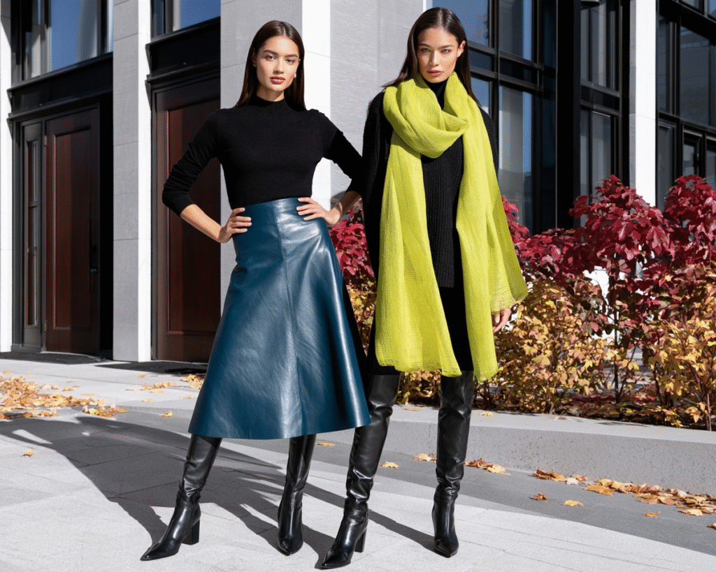
For this edit, we’re looking at color with presence in more than one form—from vivid brights and softer hues to deeper seasonal shades. Each piece offers a way to bring personality to fall neutrals through color, silhouette, texture, pattern, or layering rather than novelty.
This post may contain affiliate links. If you purchase through these links, The Aesthetic Edit may earn a small commission at no additional cost to you.
QUICK PICKS
Five standout ways to bring color into fall style…
Cobalt Mixed-Pattern Sweater
BEST GRAPHIC COLOR
Why It Stands Out: Saturated cobalt blue combines with contrasting stripes and checks for a bolder take on adding color. The graphic pattern gives the shade even more presence, making this an easy focal piece for simple neutral separates.
Petrol Blue Leather A-Line Midi Skirt
BEST COLOR + TEXTURE
Why It Stands Out: Petrol blue brings an unexpected depth of color to a classic midi silhouette, while genuine lambskin leather adds smooth texture and subtle sheen. Together, the distinctive shade and luxe material make the skirt a strong focal point without relying on pattern or embellishment.
Royal Purple Water-Repellent Trench Coat
BEST STATEMENT LAYER
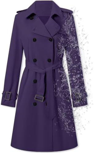
Why It Stands Out: Royal purple turns a familiar trench silhouette into a high-impact focal point, while the water-repellent construction keeps the statement practical. It’s a strong example of how one substantial layer can transform an otherwise neutral fall look.
Fresh Lime Cotton Scarf
BEST ACCESSORY POP
Why It Stands Out: Fresh lime delivers noticeable contrast in an accessory that can be added, removed, and restyled with ease. Its lightweight hand-loomed cotton texture makes it a versatile way to energize darker fall neutrals without committing to a colorful statement garment.
Oxblood Croc-Embossed Heeled Bootie
BEST POLISHED ACCENT
Why It Stands Out: Deep oxblood, glossy leather, and crocodile embossing give this sleek bootie multiple layers of visual interest. It brings rich color into a neutral outfit from the ground up while demonstrating how texture and finish can make a deeper shade feel just as impactful as a brighter one.
THE FALL POP OF COLOR EDIT
Color doesn’t have to take over the outfit to change it. The pieces in this edit work at different levels—from statement layers and head-to-toe color to standout separates and smaller accessories that give a neutral combination a noticeable shift.
The common thread is versatility. Each selection brings enough color presence to register against fall neutrals while offering its own way to create impact—through saturation, pattern, texture, silhouette, or scale. From softer Lavender and Petal Pink to vivid Cobalt and Fresh Lime and deeper Oxblood and Royal Purple, the edit shows just how varied a pop of color can be.

Best for: Polished Everyday Color
A soft lavender update to the classic button-down, this tailored shirt brings color into workwear and everyday looks without overpowering the outfit. The stretch cotton-blend construction keeps the silhouette polished and comfortable, while the lavender pairs easily with charcoal, navy, black, cream, or chocolate for a lighter pop of color.

Best for: Patterned Color with Personality
Rich emerald green gives this polished blouse its color presence, while the white polka dots, ruffled front, and softly puffed sleeves add dimension beyond a solid basic. Pair it with cream, black, charcoal, chocolate, or navy to let the green pattern become the focal point while keeping the overall look grounded.

Best for: Soft Color with a Polished Finish
Petal pink brings a softer pop of color to fall layers, offering a fresh counterpoint to deeper seasonal shades. The cashmere-blend knit, fitted silhouette, and gold-tone buttons give this cardigan a polished finish that pairs easily with charcoal, chocolate, navy, cream, or black..

Best for: High-Impact Pattern Play
Cobalt blue gives this relaxed V-neck sweater its bold color presence, while the mix of stripes and checks adds graphic energy and dimension. The saturated blue stands out easily against cream, charcoal, black, or chocolate, making it a strong option for bringing both color and pattern into a neutral fall look.

Best for: Color with Fall Texture
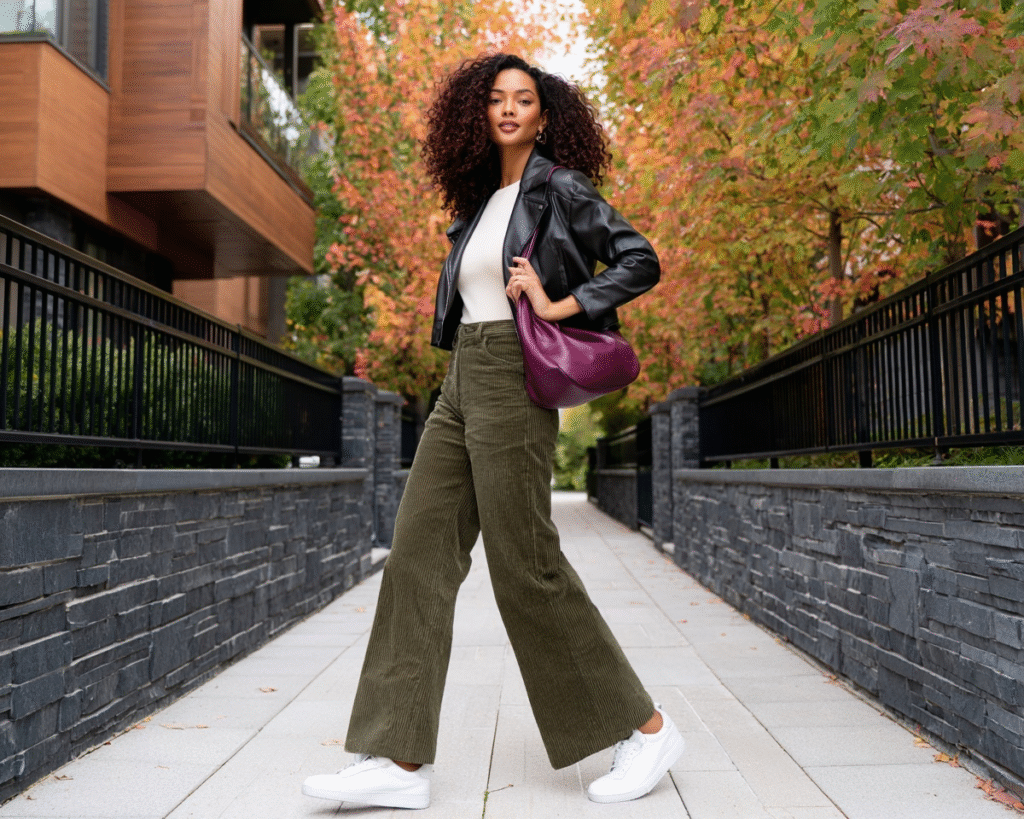
Olive green gives these wide-leg pants a rich seasonal presence, while the ribbed corduroy adds texture and depth to the color. The relaxed silhouette works easily with cream, black, charcoal, or chocolate layers, offering a grounded way to introduce color beyond tops and accessories.

Best for: Polished Color with Luxe Texture
Petrol blue gives this A-line midi skirt a rich color presence, while genuine lambskin leather adds smooth texture and subtle sheen. The high-waisted, softly flared silhouette pairs easily with black, charcoal, cream, or chocolate, bringing color and material contrast to polished fall looks.

Best for: Head-to-Toe Seasonal Color
The chili red gives this pleated midi dress a warm, saturated presence that feels especially suited to fall. The fluid chiffon, tailored shirt details, and waist-defining belt balance softness with structure, creating a complete color statement that pairs naturally with cream, camel, chocolate, or black accessories.

Best for: One-Piece Color Impact
Oxblood gives this wide-leg jumpsuit a deep, sophisticated color presence that works especially well for polished fall dressing. The waist-defining tie, fluid wide-leg silhouette, and softly voluminous sleeves create shape and movement, while the rich hue pairs naturally with black, charcoal, cream, or metallic accessories.

Best for: Statement Color for Polished Layers
Emerald green gives this tailored blazer a rich, confident presence that can instantly shift a neutral foundation. The slim silhouette and classic lapels keep the look polished, while the saturated green stands out especially well against black, charcoal, cream, navy, or chocolate.
Best for: High-Impact Outerwear Color
Royal purple turns this classic trench into a statement layer, bringing substantial color to a fall look without relying on pattern or embellishment. The double-breasted silhouette, adjustable belt, and water-repellent construction balance polished structure with everyday practicality, while the saturated shade works especially well over black, charcoal, cream, or navy.

Best for: A Small but Noticeable Color Shift
Teal gives these cat-eye sunglasses a distinctive pop of color in a smaller-scale accessory. The translucent frame and blue-gradient lenses add depth without overwhelming the look, making them an easy finishing piece for black, charcoal, cream, navy, or chocolate fall outfits.

Best for: Bright Accessory Color
Fresh lime gives this lightweight cotton scarf an energetic hit of color that can immediately wake up a neutral fall look. The hand-loomed texture and generous proportions add softness and dimension, while the vivid yellow-green stands out especially well against charcoal, navy, chocolate, black, or cream.

Best for: A Light Neutral Counterpoint
Ivory gives this slim belt a crisp neutral presence that balances the edit’s stronger colors while still adding contrast against darker fall pieces. The textured finish and sculptural gold-tone buckle give the streamlined silhouette extra polish, making it an easy accent for denim, trousers, dresses, or layered looks.

Best for: Rich Color in an Everyday Accessory
Royal purple gives this genuine leather hobo bag a deep, sophisticated color presence that feels especially at home with fall neutrals. The softly structured silhouette and natural leather texture give the saturated shade added depth, while its generous size makes it an easy way to bring color into black, charcoal, cream, chocolate, or navy looks..

Best for: Polished Color with High-Shine Texture
Oxblood gives this pointed-toe bootie a rich, dark-red color presence, while the crocodile-embossed leather and glossy finish add another layer of visual depth. The sleek ankle silhouette and slim heel make it a polished way to introduce color at ground level, especially with black, charcoal, cream, camel, or denim.
These are affiliate links, as a member of the Amazon Associates program we will earn a commission on qualifying purchases.
BLENDING NEUTRALS WITH POPS OF COLOR
The goal isn’t to find one “right” color combination. What matters more is deciding how much impact we want the color to have and giving it a neutral foundation that lets it register. Whether the color comes through a statement layer, a standout separate, or a smaller accessory, proportion, saturation, and texture can all change how prominent it feels.
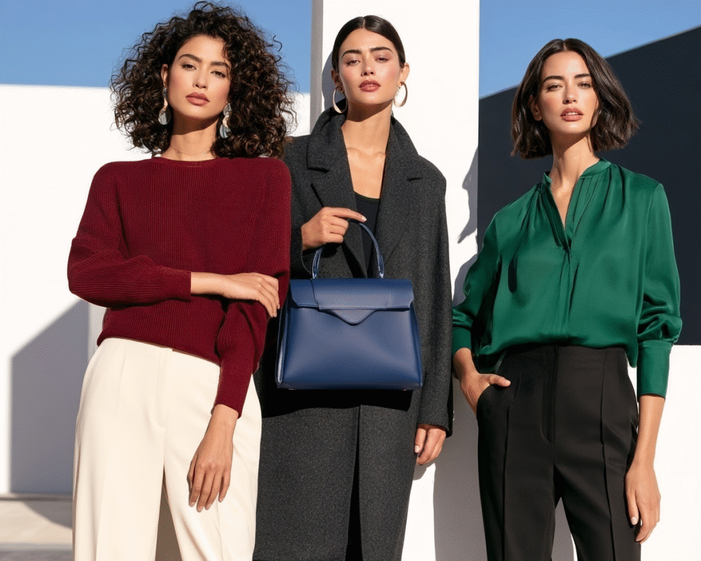
- Give one color the lead. Start with a focal shade and let the surrounding neutrals support it. A Cobalt sweater against charcoal or a Chili dress finished with camel accessories creates contrast without making every element compete for attention.
- Use saturation to set the volume. Brighter shades such as Fresh Lime and Cobalt naturally command attention, while Petrol Blue, Olive Green, and Oxblood create a deeper, more understated kind of contrast. Softer shades like Lavender and Petal Pink can lighten the palette without losing their presence.
- Consider scale. A Royal Purple trench makes color a major part of the outfit, while a Teal pair of sunglasses or an Oxblood bootie introduces it in a smaller dose. The same neutral foundation can support either approach.
- Let texture add dimension. Color becomes more nuanced when material and finish enter the equation. Smooth leather, croc embossing, corduroy, cashmere-blend knit, and lightweight cotton each give their respective shades a different visual character.
- Think beyond one outfit. Look for colors that work across several wardrobe neutrals rather than with one specific combination. Emerald, for example, can shift easily between black, cream, charcoal, chocolate, and navy, giving a colorful piece more opportunities for repeat wear.
The strongest combinations leave room for both sides of the palette to do their job: neutrals create continuity, while color brings the shift. There’s no need to use every shade at once or reserve brighter hues for statement dressing. Sometimes one contrasting piece is enough to make familiar fall staples feel completely different.
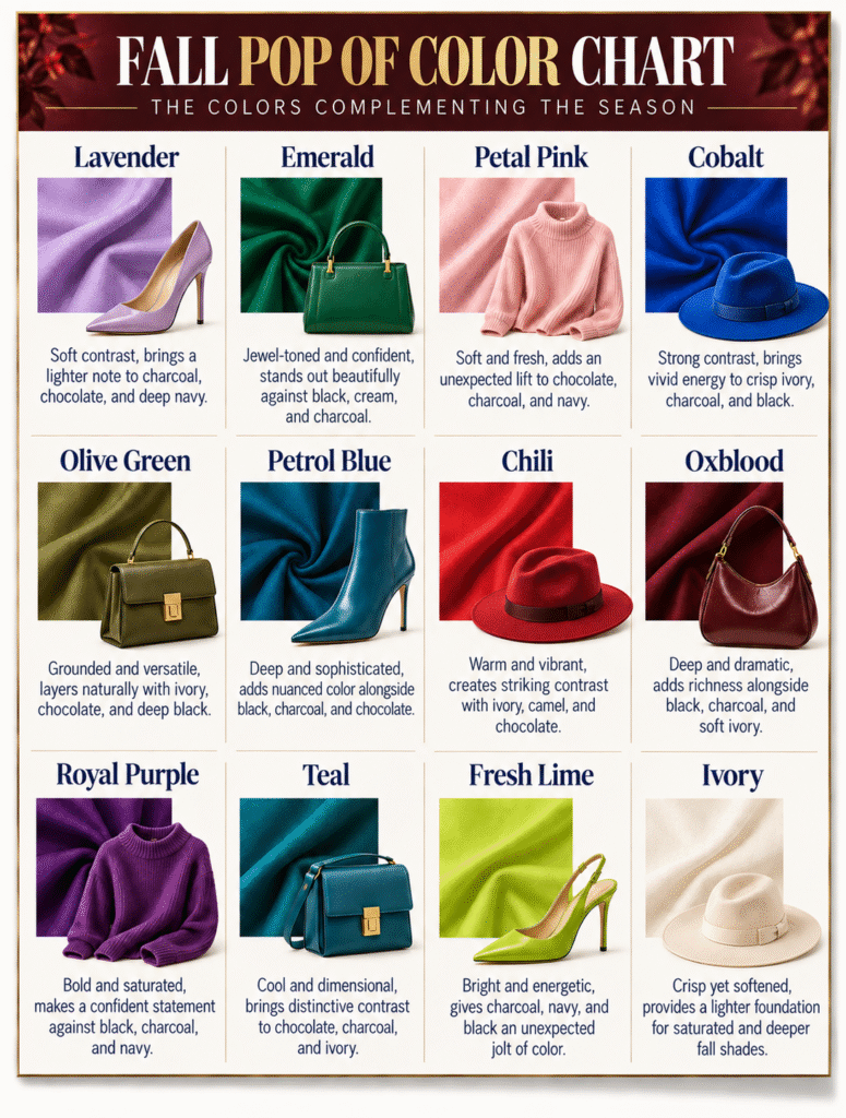
FALL FASHION COLOR DECISION AID
Color can shift the character of fall neutrals without replacing the foundation they provide. This season’s palette moves between vivid brights, softer transitional hues, and deeper saturated tones—giving black, charcoal, cream, camel, caramel, and khaki a different energy depending on the pairing. The colors below offer distinct levels of contrast while remaining versatile enough to work across modern fall layers, textures, and silhouettes.
LET COLOR CHANGE THE LOOK
Fall neutrals already give us the foundation. Sometimes what makes them feel new again is simply introducing something they weren’t designed to disappear beside.
From softer shades and vivid brights to deeper seasonal color, even one well-chosen piece can shift the mood of familiar fall staples. Color can lead the look or simply add contrast at the edges—the key is choosing a shade and piece that feels distinctive while still working naturally with what’s already in the wardrobe.
Keep the foundation. Change the color. See the look differently.
For another approach to refreshing the fall wardrobe, explore The Fall Transition: Modern Style for Cooler Days, with ideas for shifting everyday style into the season through thoughtful layers, texture, and modern fall dressing.